Every IDE ever built has the same UI primitive at its core: the tab. A row of little rectangles at the top of the window, each hiding a single buffer behind it. Click one, see one thing. Click another, see another thing. Never see two things at once unless you open a split.
This is fine when the mental model you're juggling fits inside a single file. It is an absolute disaster when you're running four AI coding agents in parallel on a messy, cross-cutting refactor, with notes pasted from your PM, a screenshot from design, and a browser window showing the live preview of the thing you're building.
There's a better primitive. It's called a canvas.
The problem with tabs for AI workflows
Tabs optimize for one thing: density. You can stack fifty of them along a single strip of pixels and still sort-of find what you want. But they're terrible at context. A tab is a point of attention, not a map of attention. You can't glance at a tab bar and understand the shape of your work — you have to click through each one to remember what's behind it.
For AI coding, this is doubly painful. Running four agents in four tabs means you can only watch one agent at a time. The other three are running invisibly; you trust they're working, but you have no sense of their progress, no sense of their output relative to each other, no sense of the shape of the thing you're building.
Now add a sticky note with the product spec. Add the original mockup your designer sent. Add a browser tab pointed at localhost. All of them shoved into the same horizontal strip, all equally invisible, all equally out-of-context.
The limit of a tab bar isn't how many tabs you have. It's how much of your workflow you can hold in your head at the same time.
Why a spatial canvas works differently
Humans are embarrassingly good at remembering where things are. Show someone a desk covered in papers, take the papers away, and most people can reconstruct roughly where each document was. This is called spatial memory, and it's one of the oldest, cheapest cognitive shortcuts in the human brain.
Canvases exploit this. Figma uses it. Miro uses it. Excalidraw uses it. They work because "upper-left is the spec, upper-right is the mockup, middle is the prototype, bottom is the feedback" is a sentence your brain can hold onto effortlessly, forever.
Lemonade Studio brings that same idea to AI coding. Instead of a tab bar with invisible buffers, you get an infinite plane where every asset in your workflow — terminals running agents, sticky notes, reference images, live browsers, multi-terminal groups — lives as a draggable, resizable node. You arrange them once, and they stay arranged.
The five node types in Studio
Studio isn't a free-form drawing tool. It's a small set of opinionated node types, each designed for a specific role in an AI coding workflow.
Terminal nodes
A full PTY terminal, same as every cell in the Workspace grid. Drop any AI agent into it — Claude Code, Gemini CLI, Codex, Aider, Cursor, OpenCode, or a custom CLI. Drag it, resize it, pin it in place. Zero constraints on where it goes or how large it is. You can have one terminal the size of a postage stamp and another the size of your entire screen, on the same canvas.
Group nodes
A multi-terminal container that packs up to 8 agents into a single draggable grid. Useful when you want to keep a "squad" of related agents together — e.g., one group for backend work with three agents, another group for frontend with two — and move them as one unit around the canvas.
Sticky notes
Color-coded annotations in seven colors. Perfect for product specs, TODOs, architectural decisions, reminders, or the thing the client said in that one meeting that you cannot forget. Resize freely. Pin anywhere. Notes live alongside terminals as first-class citizens, not off in some sidebar.
Media nodes
Drag images, PDFs, and audio files straight onto the canvas. PNG, JPG, GIF, WebP, SVG — all handled natively. Aspect ratio is locked on resize so your mockups don't warp. Use them for design references, screenshots of bugs, whiteboard photos, or anything visual that informs what the agents are building.
Browser nodes
An embedded web browser, right on the canvas. Full address bar, back/forward, refresh button. Preview your dev server without alt-tabbing. Keep the production site open next to the staging version. Pin docs to the corner. The browser is just another draggable rectangle.
Pan and zoom mechanics
Studio's canvas is infinite — you can pan in any direction forever — and zooms from 0.25× to 3×. Trackpad pinch, Ctrl+scroll, or keyboard shortcuts (Ctrl++ / Ctrl+-) all work. Double-click empty space to recenter.
The zoom is more than a UI nicety. It's how you navigate. At 0.3× you see the whole workflow as a map — "there's my backend squad, there's the UI preview, there's the spec I'm implementing." At 1.5× you dive into a single terminal and watch an agent work. Zoom out, reassess, zoom back in. It's a loop your brain already knows from Google Maps.
Right-click to build your workflow
Studio has no toolbar, no side panel, no floating palette. The UI is the canvas and the right-click menu. Right-click anywhere on empty space and you get a menu: spawn a terminal, spawn a group, spawn a sticky note, spawn a media node, spawn a browser. The node appears where you clicked.
This sounds like a small thing. It isn't. The absence of UI chrome is what makes the canvas feel infinite. Your eyes are on your work, not on the menus around it. The only visual elements on screen are the things you put there.
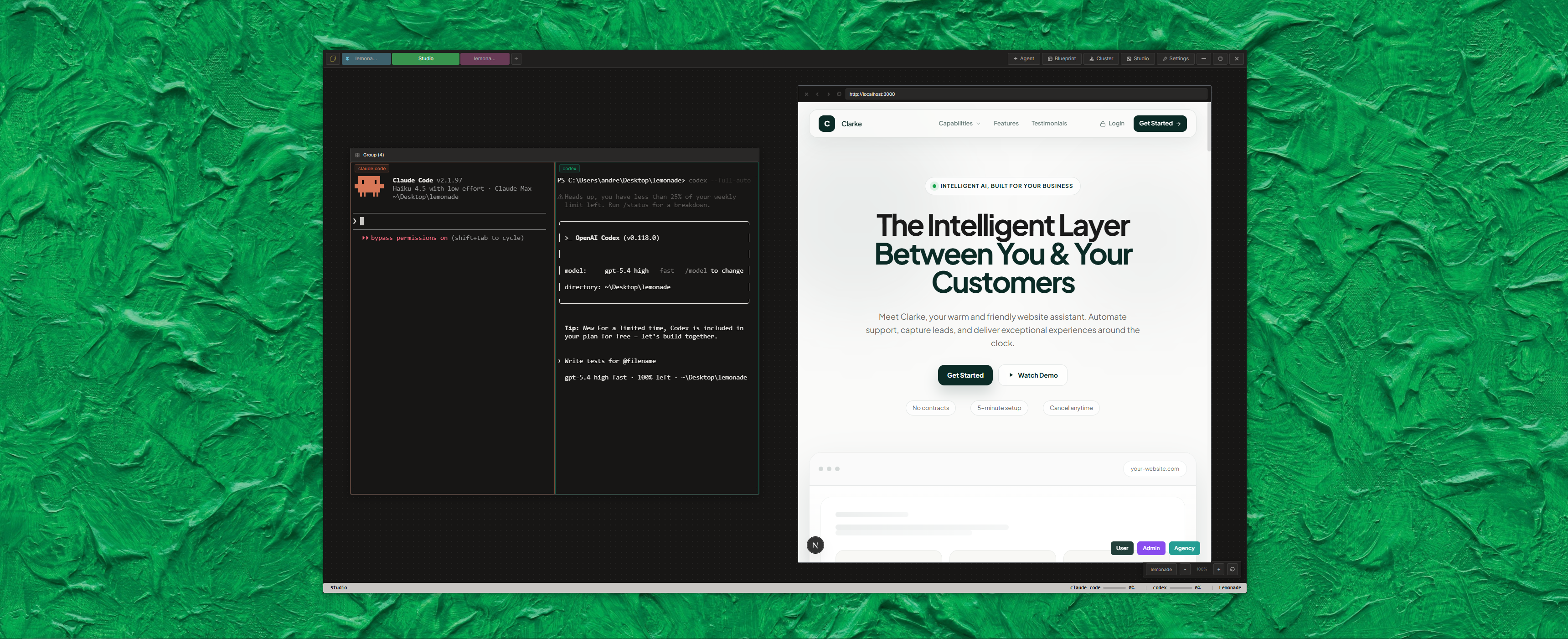
A real-world Studio layout
Here's how we actually use Studio day-to-day on a feature build:
- Upper-left: a sticky note with the spec from Linear, copy-pasted verbatim so we never drift.
- Upper-right: a media node showing the Figma mockup. Pinned, never moves.
- Center: a group node with three terminals — Claude Code doing the main implementation, Gemini reading the existing code for context, Aider prepped to clean up commits at the end.
- Lower-right: a browser node pointed at
localhost:3000so we can see the feature appear as it's built. - Lower-left: another sticky note with "Things I'll forget" — edge cases, follow-up TODOs, typos spotted in passing.
The whole layout survives as long as the Studio tab is open. Zoom out to see the big picture, zoom in to watch Claude type. The spec is always there. The mockup is always there. The preview is always there. You never lose context because the context is a place, not a tab you forgot to click.
What's coming next
Studio is still young. The node types we've shipped are the ones we reach for every day, but there are more on the way. The one we're most excited about is task nodes — interactive to-do lists pinned anywhere on the canvas, so you can check items off as your agents complete them and keep the whole squad on mission. It's the kind of primitive that only makes sense on a spatial canvas.
We're also eyeing persistent canvas state — right now Studio resets when you close its tab, which is fine for exploration but less ideal for long-lived workflows. That's on the roadmap.
Try Studio mode
Studio ships with every copy of Lemonade. Launch the app, switch to Studio mode from the titlebar, right-click the empty canvas, and start building. A workflow you arrange once will feel like yours forever — because spatial memory is doing the work you used to do with willpower.
The canvas is waiting.